Kapost Color Palette Overhaul
Through the past several designers, developers, and design trends, the Kapost app has become quite disjointed and inconsistent from a UX perspective, which is why a big effort from the design team at Kapost this year has been to unify the platform through things like colors, buttons, input fields and more. This was inspired by an article shared with the design team earlier this year.
Goal: Begin the "Kapost platform unification" with one of the most fundamental pieces of design, the color palette.
I worked exclusively with the senior UX designer, Christine, to do an audit on the colors in the app and completely overhaul the palette using both Sketch and GitHub, keeping in mind our platform's Material Design roots. This is a snippet of the result of our efforts:
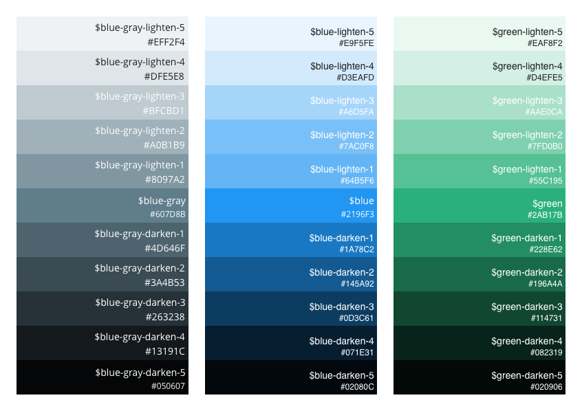
We worked with a lead developer and created primary, secondary, accent and neutral palettes; you can see the three new primary hues above. Colors went from disharmonious and inconsistent across usage and products to being completely unified and used with purpose.
You can view the Kapost design repo to see more details on our efforts to unify and harmonize the app's UI components. Enjoy!