Kapost Global Settings Redesign
Today, Kapost's settings are very scattered throughout multiple pages and points of the platform. There are 25-30 separate settings pages that can be turned on/off in the side nav and accessed from multiple touch points within the platform.
Using one of our end-of-quarter hackathons, I spent a week auditing Kapost's settings, working with two of our Product Managers on bucketing them into better categories, creating wireframes and hi-fi's to present to the department at the end of the week.
Goal: Use Product & Engineering's week-long hackathon to prove the importance of having a more centralized Settings page and user experience in the Kapost platform.
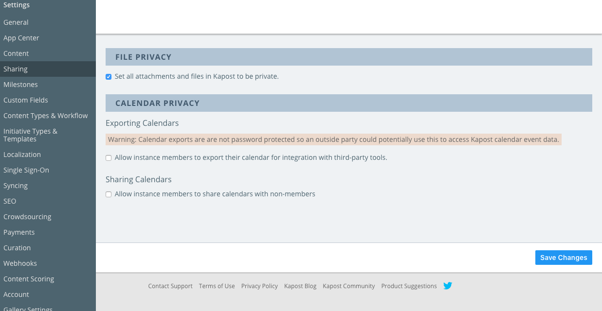
The following screenshot will give you a general idea of how many settings pages we have in the left nav, as well as the look of them:
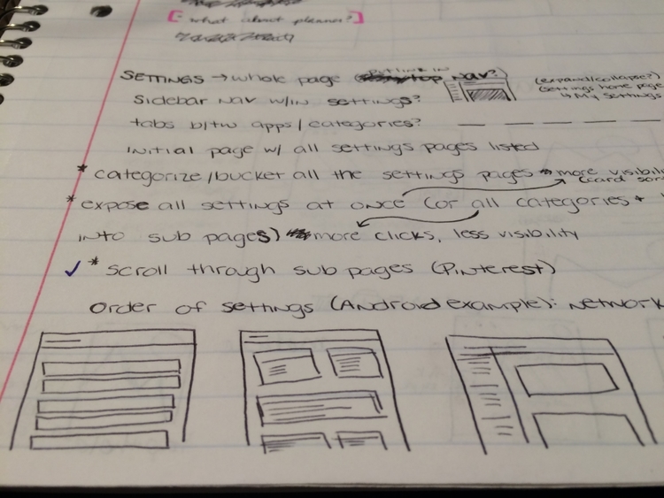
The process towards new settings starts with lots of research and sketching...
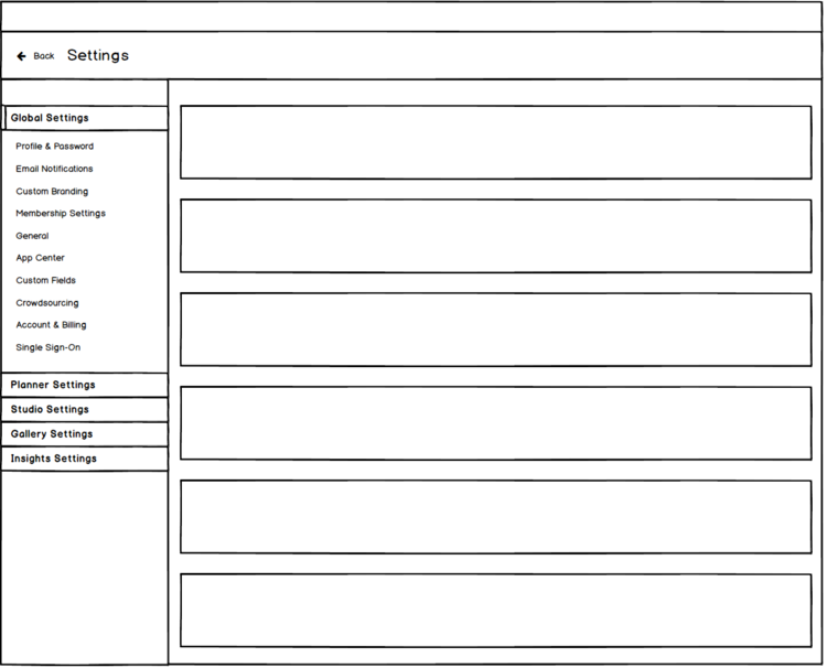
And then wireframes to talk through with the product managers...
And finally, hi-fidelity mock-ups to present to the Product & Engineering department. Below is a preview of the breakdown and hi-fi design, all three screens are viewable on InVision.
This was a great exercise as I was able to do a few things, such as:
- Standardize a lot of the color usage and spacing/dimensions with our new Shared-UI app unification components and usage guidelines.
- Work with a Product Manager that I don't usually interact with as they are on a different team at Kapost.
- Present and prove the worth of a project that was recently bumped off of the roadmap.